Philosophy of the UPA TIK Logo
This logo is designed as a visual representation
of the dynamic, professional,and technology-oriented
identity of UPA TIK Universitas Riau.


"TIK" Typography Shape
The logo is a combination of the letters "T", "I", and "K" arranged geometrically and minimally. This reflects the unit's main focus on Information and Communication Technology.

Technology Symbol
The square shape in the logo symbolizes digital elements, order, and systematic structure in the world of technology. This reflects the close relationship of UPA TIK with information and communication technology.
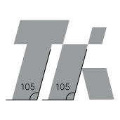
Italic Style
The italic shape in the logo symbolizes forward movement, speed, and innovation, while illustrating that UPA TIK is a progressive, continuously developing unit that always provides the best solutions in the field of information and communication technology.